Terramoto
What’s your name and where are you from/based?
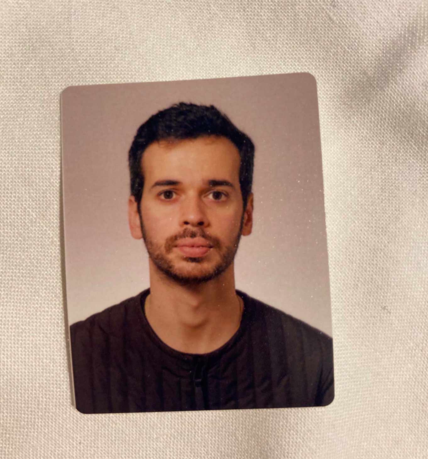
My name is Nuno Pires, and I’m the founder of Terramoto Studio based in Porto, Portugal.
Can you describe what you do in a few words?
Our studio is a place where creativity, graphic design, and strategy meet — sometimes it’s tricky to describe our work because a traditional graphic design studio works mainly in the digital and vectorial world, whereas we tend to explore different media, from the physical and digital world.
We tend to present ourselves as “aesthetic operators” — we shape and manipulate visuals with intention and sensitivity to communicate and connect with a specific audience.
What was the concept for TERRAMOTO STUDIO when it started in 2018?
Terramoto Studio started in 2018 at the Glasgow School of Art, as part of my master’s in graphic design. It started as a publisher releasing writings & objects as opposed to books.
The concept for the publisher was to rethink the book as an object and give a better experience to the reader — the writer writes texts, not books.
This was activated from time to time, as a side project.
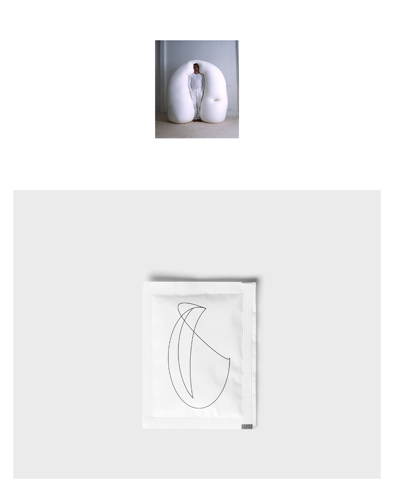
Then, in 2023, I ended a partnership that I had with a studio in Glasgow and started my practice in Porto. Due to my interest in objects and the material world, I evolved the concept of the publisher into communication design, and, whenever possible, I would create objects to communicate brands or projects.
Many of your projects involve collaborations with other brands, what makes a client or partner a good fit for you?
A good client is always a client who values your work. For us, it’s important that when the client sees our portfolio or a specific project, it truly speaks to them; this is always a good starting point.
We try not to be that studio that focuses on a specific type of client or industry, as we like the diversity and variety of people, projects, and businesses.
Can you walk us through your design process for a project, from initial research to final execution?
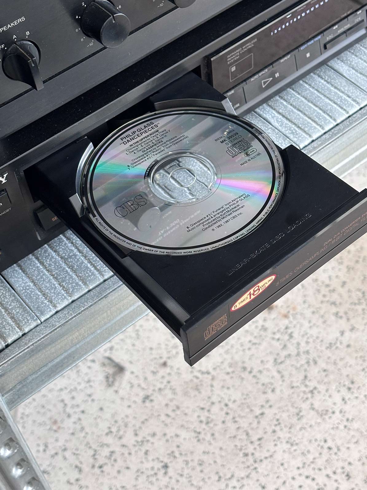
We have a strong connection to music, and it plays a key role in our creative process. Our journey often begins by selecting one to three albums that resonate with the project. But before we get lost in the world of music (trust us, once we start talking albums, we won’t stop), we always begin with a few key questions. This step is essential—it’s about finding the right answers that help us understand exactly what the client needs.
We take a very strategic approach to our work and collaborate closely with a brand strategy team to ensure we’re aligned from the start.
Once we’ve grasped the project’s goals, positioning, and target audience, we dive into early concepts, all while keeping our chosen albums on constant loop.
From there, we brainstorm a variety of ideas that we believe could work. Sometimes the right concept emerges quickly; other times, it takes a time. But that’s the beauty—and the challenge—of creativity, isn’t it?
Once we have a solid concept in mind, we gather references to support it and create a moodboard to visually communicate our direction. We’ve found that visuals are an effective way to help the client truly grasp our vision.
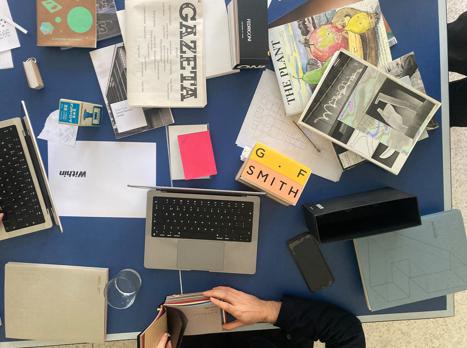
While this is typically our standard process, there are times when we feel stuck and need to dig deeper. In those moments, we turn to books, websites, and other resources to spark new ideas and ignite a strong early concept.
Once we’ve honed in on the direction, we share it with the client, pitching the concept with supporting references, early sketches, and a bit of copy to bring the idea to life.
What do you think is the most challenging part of the process?
The challenges we face vary greatly depending on the client or the project. Sometimes it’s a matter of tight timing, like when we’re given very short deadlines because everything needs to be done yesterday. Other times, it’s about maintaining momentum throughout the project.
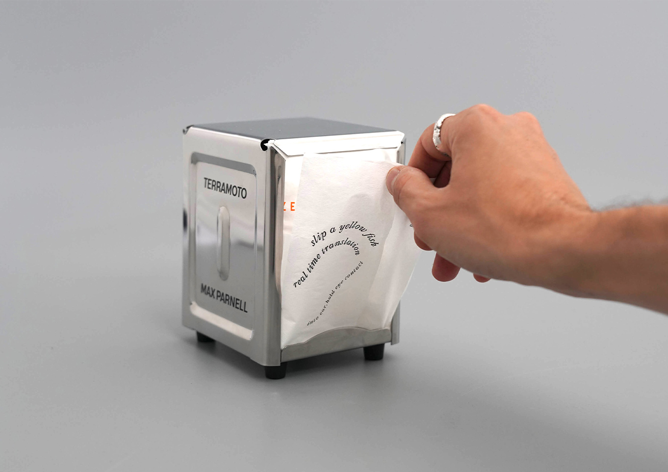
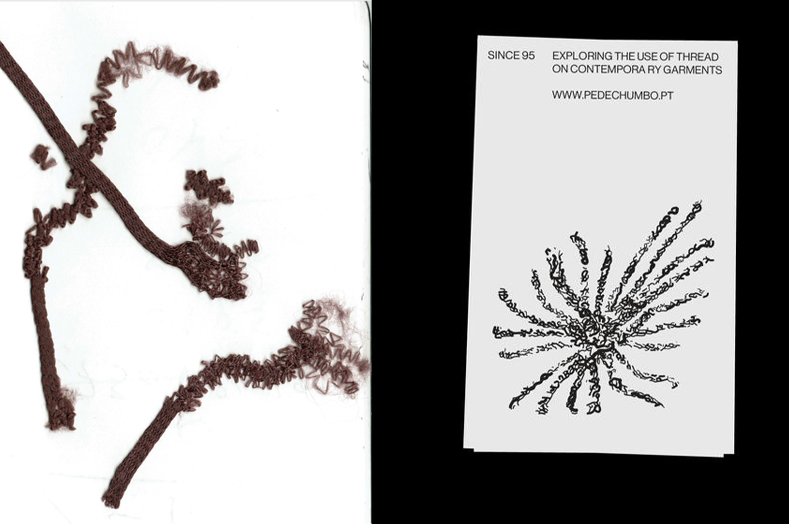
Another challenge can come from the production side, such as manually printing over 600 napkins with silk screening in under three days.
At this stage, we welcome all of these challenges. We’re excited to push ourselves and go the extra mile, and we’re grateful for the opportunities to grow along the way.
One of the more challenging aspects of our business is prospecting for new clients. As a young design studio—just 1.5 years old (we’ll be celebrating our second anniversary in September)—balancing creative work with outreach and client acquisition is no easy feat. It’s not something that comes naturally to us, but we understand how crucial it is for the growth of our studio.
Is there a project in the portfolio that felt particularly memorable to the team? Why?
Yes, the aDrogaria.
It was the first project that we did that merged the idea that we had for Terramoto Publisher (objects, not books), but now with Terramoto Studio, using it to create a visual identity (not a conventional logo or vector-based identity but an object).
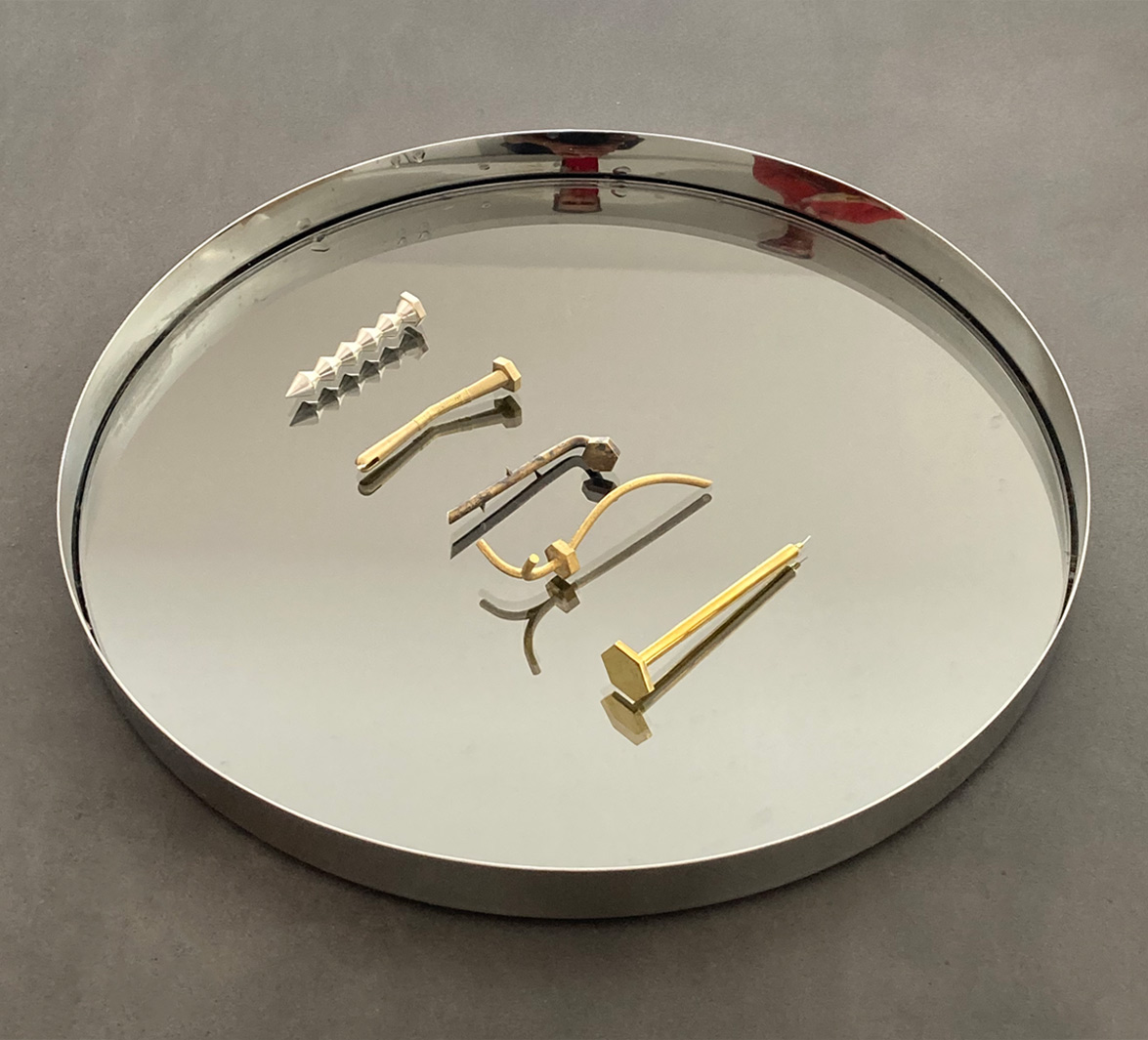
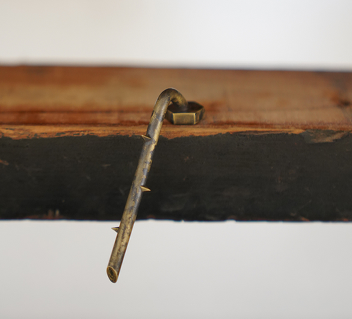
This was a project made in collaboration with the artist collective from @a_drogaria_ where we designed five screws made of brass to communicate the five exhibitions.
aDrogaria is a collective of artists that present exhibitions, events, and annual programs in various spaces.
In its first year, the project took place at aSede, a gallery in Porto that previously operated as a hardware store for over a century. The name Drogaria translates to hardware shop in Portuguese—an homage to the space’s history, which also inspired the central object of the project. Why a screw to communicate a series of exhibitions? The collective wanted to honor the identity and heritage of the former hardware store. Instead of creating a conventional logo or vector-based identity, we proposed using a unique screw design for each exhibition, with each one inspired by the group of artists involved in that show. Much of the project’s content was created without computers. We used only our phones to capture photos and videos of the screws, placed throughout the gallery and in the hands of Sr. Benjamim, a longtime employee of the original hardware store.
All five screws were produced in collaboration with a local jeweller. Each was cast in brass, with varied finishes including acid-treated, polished, and silver-plated surfaces.
Looking back, is there a project that feels like a turning point in your studio’s evolution?
Yes—and funnily enough, it was a self-initiated studio project.
Last August, we decided it was time to create our business card. We were coming up to our first anniversary in September, and we figured that if we’d made it this far, it was time to make things feel more legit, starting off with some cool business cards.
But a standard 5.5 × 8.5 cm piece of paper didn’t feel right. Since we look tables as publications and have used screws as a visual identity work, our business card had to reflect the same spirit. It needed to introduce our business, not just with information, but through experience and creativity.
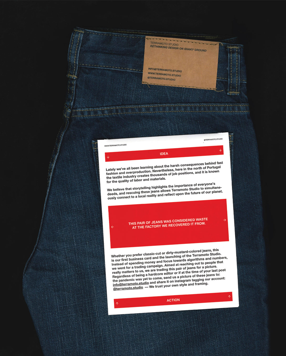
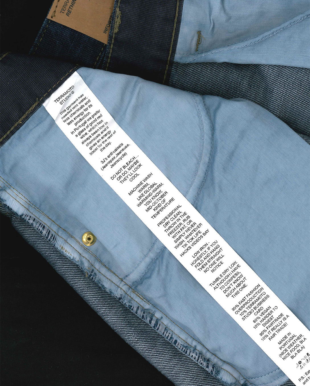
After much thought, we decided our business card would be—a pair of jeans.
Yes, brand new, unworn, produced in Portugal… and given away for free.
How? Why?
These jeans were made from upcycled textile waste, rescued from factories in northern Portugal. Each pair is unique and unworn. Thanks to some contacts in the local textile industry—a major hub here in the north—we were able to source leftover stock, with some jeans even donated. They all had minor imperfections—some more noticeable than others—but nothing that affected their wearability. We thought those flaws gave them character.
We had fun writing playful copy for the labels and branding the jeans as our “business card”. We sent them to past collaborators, people we’d love to work with, curious visitors who dropped by the studio, and, of course, to friends and family. The idea was simple: “If they don’t fit you, give them to someone else.”
The result? A huge success. We’re now working on bigger projects with brands that first heard about us through… our business card.
What’s something about multidisciplinary design that you wish more people understood?
Right now, within our clients and close network, we’re noticing a growing interest in working with studios that take a broader, more multidisciplinary approach. More and more, people are seeking creative partners who can do more than just graphic design—they’re looking for someone who can also handle strategy, content, and execution across various formats, media, and platforms.
That said, there are still clients who come to us for pure graphic design support—and that’s valid, too.
But the reality is that today’s brands need to be present in so many formats and spaces that this kind of multidisciplinary thinking becomes a real asset. Working with a team that doesn’t just design visuals, but also thinks strategically—about tone of voice, communication goals, and whether an identity should live as a vector or a physical object—opens up a world of creative possibilities. And that’s something clients can see real value in.
From our experience, the people we work with—both clients and collaborators—genuinely understand and appreciate this way of working. We believe that’s where the interest in our work comes from: the element of surprise, the creative thinking, the ability to think a few steps ahead… When most people think of communication design, they immediately think of graphic design, but when it becomes a designed object, it reframes that expectation. And that shift can feel both new and refreshing.
Where can people find you?
You can find us in Porto — we have a space on Rua do Moreira, Porto, Portugal — DM us for the door number and we’ll happily offer you a Port (or a coffee) 🙂
IG: @terramoto.studio
WB: www.terramoto.studio
Right now, we’re working on some very exciting projects with a biotech startup, a disruptive shoe store, and our first Portuguese wine client!
One we can already share (and turn into a bit of an invitation) is a collaboration and event we’re cooking up with the coolest shop in Lisbon, @parlamento.lisboa. This will happen around September, so stay tuned!